Using Figma Kits to Kickstart Your Design System
Last updated: June 15 2022
If you’ve ever kicked around the idea of starting a Design System for your team or product, you’ve probably had the sobering realization of just how much work it is to create one. While the benefits of a Design System are numerous, getting one set up requires a large investment of time and effort upfront. Ultimately, Design Systems are time-savers – a single source of truth that speeds up both the design and dev processes – but that doesn’t mean it’s easy to get one off the ground. Not to mention, everyone might not be completely sold on the idea yet, so asking for a big chunk of time right away can be a hard sell.
In general (much to the dismay of every manager I’ve had), I’m a strong believer in asking for forgiveness instead of permission when it comes to implementing new ideas. You can collect data, read case studies, and make PowerPoint presentations until the inevitable heat death of the universe, but some folks just need to see something that’s actually functional (even if it’s still early stages) in order to truly understand it. This can be especially true of Design Systems (or really any system), because they’re a little bit abstract – if someone haven’t used one before, they might not fully grok the concept.
But, while “just do it” is a catchy quip (and easy advice for me to give, with no actual skin in the game), it’s easier said than done to “just” work in Design System work around your actual responsibilities. So, how do we get a quick and dirty Design System MVP up and running, with minimal time investment, in order to demonstrate the benefits? We do what great artists have done for centuries: start with someone else’s work.
Thankfully, in this case, you don’t even have to steal anything – we’re going to start with the free Kendo UI Figma Kit, and use that as a basis to kickstart a new Design System for my heavily-themed KendoReact demo app. If you’re not familiar with what a UI / Figma Kit is, this article would be a good thing to read before we go any further.
Getting Started
First, we’re going to duplicate the Figma Kit to our own Figma account, so we have a copy we can work with. When we open it up and take a look, we can see that we already have all the components we could possibly need, as well as a long list of design tokens along the right-hand side. This is the perfect jumping-off point for us to start customizing. Having everything already drafted and wired up in Figma means that we can focus our attention on the actual design work – choosing styles that best suit our project – and not the boilerplate of getting previews, examples, and prototypes ready.
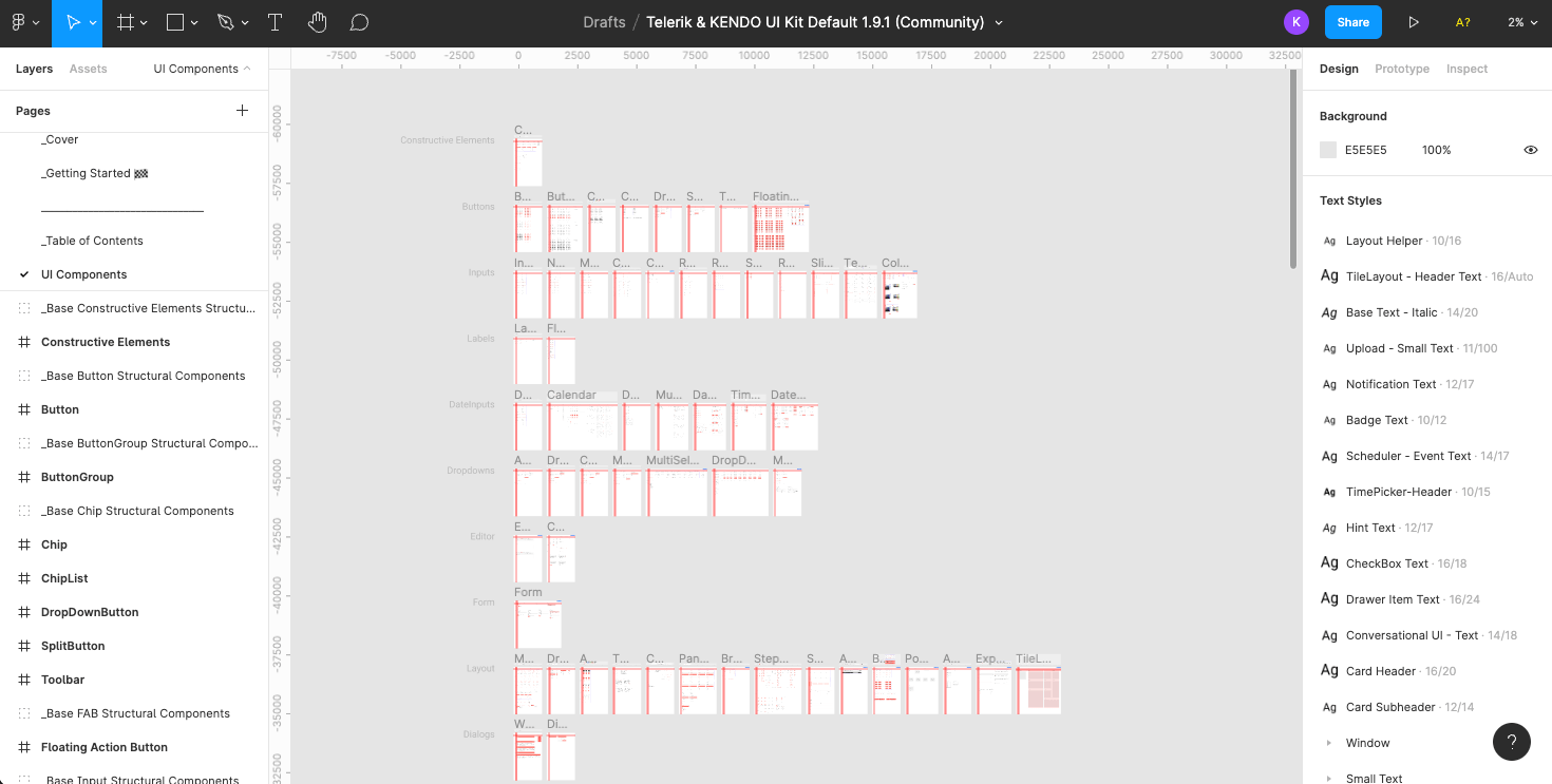
When we change things in this Figma Kit – whether that’s a font or color in our design tokens, or the layout of one of our base components – we’ll automatically see that change versioned out across the entire suite of components. That means we’ll have an immediate preview, where we can see how our design choices look in actual, real-world UI elements. If you wanted to go the extra mile (or if you have one of those “I need to see it to believe it” folks on your team), you could even throw 3-4 of those components on a separate page to make a little mockup, and see your design choices in an actual interface.
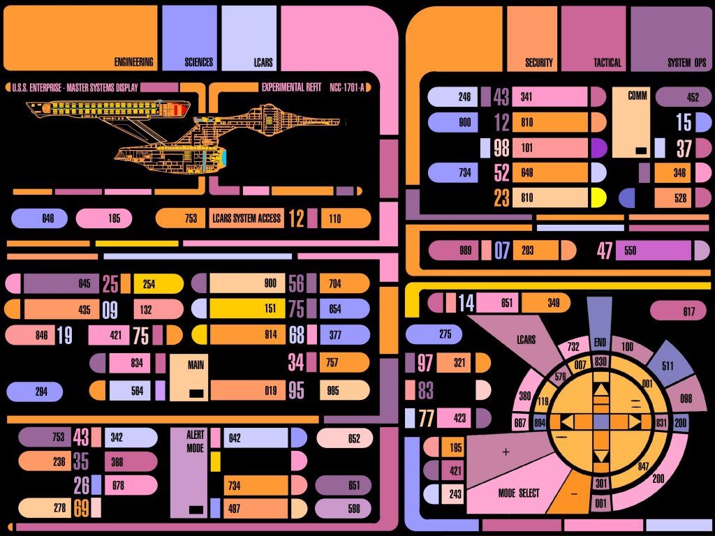
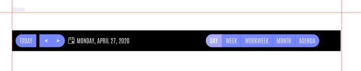
n my case, I want my KendoDemo app styles to be an homage to the “LCARS” user interfaces created by Michael Okuda for Star Trek: The Next Generation, because I’m a huge Trek nerd and a huge design nerd – a dangerous combination. In this demo, we’ll be updating a Kendo UI Figma Kit to reflect this look and feel, and then using that as the basis for our new Design System.
Design Tokens
Identifying and defining the wide variety of design tokens needed for a full Design System is one of the most tedious and demanding parts of the process. But with a Kendo UI Figma Kit, we can use the pre-existing design tokens as a basis, and know that they’re already perfectly in sync with the SASS variables of the Kendo UI components that the developers will be using – it’s a win-win.
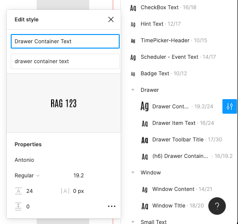
I’ve found a Google font called “Antonio” that looks similar to the one used on the show, so my first step is going to be updating all the text-based design tokens to use that font.
As we saw in the images above, the LCARS UI has a very distinctive color palette: a black background, with oranges, yellows, pinks, and the occasional lavender. That means my design token colors need an update as well – the default Kendo red is nice, but it looks soooooo early 21st century, and we want something a little more 2364.
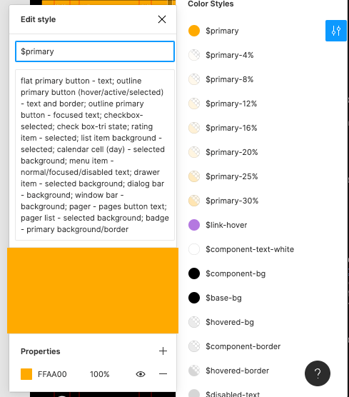
One of the best parts about using a Kit like this is that you already have all the documentation about where each token is used. For example, here I’m updating the $primary color, and in the text box under the name, I get a rundown of every place that will be affected by that change. All of this is editable, of course – I could always go find one of those elements and re-link them to a different color token, if needed – but it really speeds things up to have all of this already documented, as well as to have an idea of what the developers will be working with on their end.
Because the design tokens are used all across the Figma Kits, when we update the fonts and colors in the sidebar here, we’ll see that reflected across all the components. It lets us preview our design choices quickly and easily, so we can evaluate what’s working and what’s not.
Icons
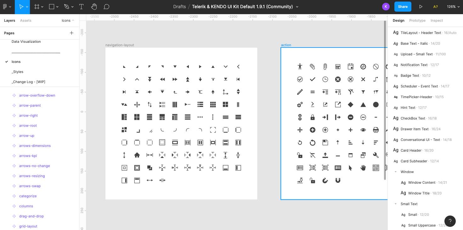
Choosing an icon library or creating one from scratch can be a time-consuming part of putting together your Design System. You could easily lose days or weeks on just your icons, depending on whether you’re evaluating third party libraries, hiring an illustrator, or taking on the project in-house. And yet, it’s also something you can’t ignore: icons are more than just cute little images to break up your text, they’re important communication tools. This is especially true if you have an interface that might be used by non-native speakers or that includes lots of technical terms the average user might not be familiar with.
With the Kendo UI Figma Kits, though, we already have an icon library built right in! And, like the design tokens or base components, we can change an icon on the Icons page and see that change reflected across all the components automatically. Change the color, adjust the look and feel, even add new icons – but save yourself a ton of time by not starting from scratch! If you make use of Unite UX in addition to the Figma Kits, you can even get all of these exported into an icon font that you (and the developers) can install and use anywhere! ****
In my case, I’m pretty happy with the look and feel of the existing icons for my LKARS app, so I’ll just leave them be – no adjustments needed.
Component Libraries
One of the largest parts of a Design System is building out all the components that will make up your Component Library. Of course, if we’re making full use of Kendo UI, then all the components are already there – designed, tested, fully accessible, and ready for us to use! If we’re really talking about saving time, this is the ultimate way to do so.
But even with all the components ready-to-use from a development perspective, we still need to tackle the design side of things. If we’ve been thorough about updating all our design tokens in the Figma Kits, then we should be seeing quite a difference in our components, already – fonts, colors, drop shadow, and more should already be using our new look and feel. But, even with all that squared away, there are still some adjustments we might want to make by hand.
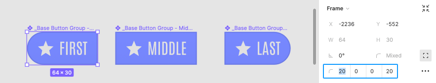
In my case, I want to adjust the border radius; the original LCARS UI system is very rounded, with lots of soft curves. I want my components to feel that way, too! Now, at first, this might feel intimidating: there are over 100 Kendo components! That’s a lot of corners to round.
Thankfully, I don’t have to go through and edit every single component in order to achieve this goal. Because Kendo UI components are designed using the Atomic Design system and these Figma Kits make use of Figma components, I can head over to the _Base (Structural Components) page and make my adjustments to those base components. The changes made to those base components will be versioned out, everywhere those components are used across the entire library. For example, the pill-shaped buttons are a huge part of the visual branding of LCARS. So I’ll update my button design at the base component level, and see that automatically reflected across every single component that includes a button.
Storybook Integration
Of course, when it comes to component libraries, the components themselves are really only half the end goal – the other half is documentation. Documentation is one of those things that everybody loves to have, but nobody loves to write. If you’re using Kendo UI, you can (of course) leverage our thorough and detailed docs – that will give you all the information you need about various APIs, configuration options, properties, and more. But it’s also nice to have documentation for the design side of things – how the components should be used and styled. If your components are heavily themed (like mine), then it’s also handy to have a place where you can preview and test your customized components, as well as actively interact with them in their various different states.
Storybook is a popular tool for this kind of work, and it’s one that we at Kendo are especially fond of. In fact, we love it so much that we’ve built a Storybook documentation export option into Unite UX, our handoff tool! So not only can you export all the code for all your design tokens and adjusted component styles using Unite UX – you can also export a set of full Storybook stories, ready for you to drop right into your Storybook instance. This might be one of the biggest time savers of them all!
Style Guides & Theme Documentation
On that note, documentation is also a big part of Design Systems in general. Often, this requires a fair bit of work to write up everything that needs to be included in said documentation – but, in our case, the Figma Kits have done a lot that work for us, already!
When I was making those updates to the design tokens before, they were automatically updating the information on the _Styles page. That means there’s no need for me spend additional time going through and collecting it all – it’s all been organized perfectly, right here with the source material.
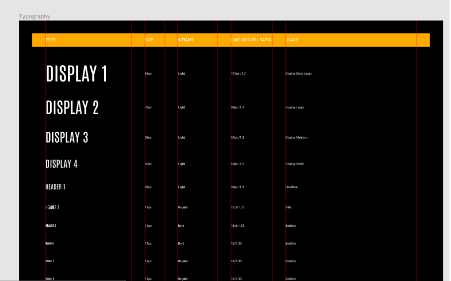
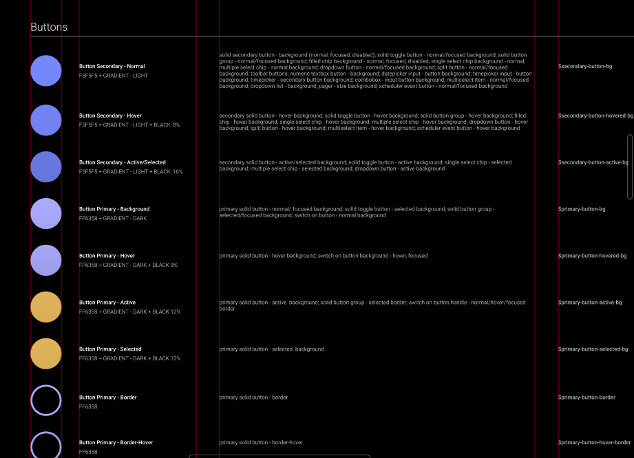
I can point the developers on my team to this page as a source of truth, and they can find everything they need to know about our styles already curated and ready for them to use. And with the Figma inspect tool, they can click on any of those items to see (and copy) the CSS properties associated!
To take it a step further, if I wanted to create a quick Style Guide for an external party to use (like an ad agency or a freelancer), I could just export the frames from the _Styles page as a PDF, send them over to whoever I want to share our styles with, and call it a day.
Jump Start Your Design System With the Kendo React Figma Kits
Other UI libraries can be so exclusively focused on the developer experience that they overlook the equally-important designer experience! As a designer myself, I was often frustrated with the limitations that third-party component libraries placed on my design work – but tools like this really change the game. With these Figma Kits, the design process is not just supported, but prioritized. Without writing a single line of code, Kendo UI Figma Kits allow you to theme and customize hundreds of components, build out an entire Design System, put together prototypes for user testing, and so much more.
These Figma Kits are 100% free; duplicate a copy today to kick off your Design System – whether you’re using Kendo or not! Either way, you’ll save a ton of time and speed up the process of building out a huge and complex system. And at the end of the day, that’s what’s really important: providing the tools for designers and developers to work together and build amazing software.
◀ Back to all blogs