A Developer's Guide to Implementing a Design System
Last updated: Aug 10 2023
So, your team has decided to implement a design system. Cool! You’ve heard the long list of benefits, the design team has sold you on how great it’s gonna be, and you’re totally bought in. You sit down at your keyboard, ready to make things happen, but that’s when you pause…nobody has discussed how this design system will actually get implemented. You’ve seen the Figma kits, the style guide, and the written documentation; it all looks great, but it’s not code.
For a design system to truly function, it needs to be an inherent part of the codebase. Making a design system easy to use is an integral part of adoption – it needs to function as a natural extension of the existing workflow. With tools like Figma, design system tokens, components, icons, and more can all be built right into the flow of a designer’s primary workspace…but what does that look like for a developer? Let’s break it down.
Laying the Groundwork
Global CSS
One of the primary benefits of a design system is the way in which it can improve the cohesiveness of our user interfaces. When everything is styled the same way, it becomes easier for users to find their way around our website or application and more accurately anticipate how elements of the UI will behave. This makes our interfaces intuitive and reduces the friction of new user onboarding and introducing new features. Not to mention, it speeds up the design and development process as well – when we can lean on a library of existing patterns and don’t have to re-invent the wheel every time we add something new, we can move a hell of a lot faster.
The heart of our design system implementation in the codebase is our global CSS file. This file will include all the basic styles required to build our components, so we can simply import it and call on our library of classes, variables, etc. when styling a page. Any styles specific to the page, component, or other element should go in a scoped CSS file that only applies to that specific part of the application. However, if we do our jobs right, those files should be fairly minimal – the vast majority of our styles will be pulled from our global CSS and re-used across the entire application.
Choosing a CSS Pre-processor or Framework
For many teams, the use of a CSS extension of some kind can help lighten the load when implementing a design system. While it is possible to use vanilla CSS (especially now that it includes math functions and custom properties/variables), there are several libraries that can still provide several useful benefits when it comes to reusing and remixing styles, doing advanced or complex computations, etc.
In general, the best option is the one the team is most familiar with and/or excited about. Adoption is one of the largest hurdles to clear when starting a design system, so anything we can do to make it easier is a step well worth taking. If the team has already been using Sass, stick with Sass! If Tailwind is your jam, go for it!
The only thing we’ll want to avoid are CSS frameworks that are tightly coupled with other design systems. For example, Bootstrap is an incredibly popular option, but it’s also very opinionated from a design perspective. Similarly, MUI is a well-known library, but it’s strictly tied to Google’s Material Design system. If design is using one of these existing systems as a jumping-off point for their own design system (which is a completely valid thing to do – and a great way to speed up the process), then using the associated framework makes all the sense in the world. However, if they’re not, then using a framework or library tied to a different design system will only create challenges down the road.
Personally, my preference is Sass: I find that the mixins, partials, and operators are hugely useful when it comes to creating re-usable snippets of code for a design system. And, since it’s “just” a pre-processor and not a framework, it’s not opinionated in a design sense and there’s no default values (colors, spacing values, etc.) that will need to be overwritten.
Design Tokens
The smallest pieces of a design system are the design tokens – colors, fonts, measurements, and other reusable aspects that get repeatedly applied to various components. For example, we generally want the border radius to be the same across different elements. When the border radius on a button is the same as the border radius on an input, it makes the design look cohesive and intentional.
In that situation, manually defining the same border radius value in our CSS over and over again on various elements would be frustrating, time-consuming, and difficult to maintain (if that value ever changed in the future). It’s only natural for us to make it a reusable variable! Design tokens work in exactly the same way. When we get a list of design tokens as part of a design system, one of the easiest and most useful things we can do is immediately turn those tokens into variables in our global CSS file.
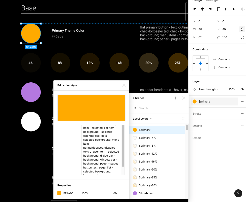
$primary: #FFAA00
That being said, there’s more to it than just “make some variables.” When we’re defining those variables, it’s also important for us to keep naming, hierarchy, and future expansion of the design system in mind.
Hierarchy and Future Growth
As the joke goes: the two hardest things in programming are cache invalidation, naming, and off-by-one errors.
As we’re naming and defining the list of variables based on the design tokens, it’s important to keep in mind that design systems (especially in their early days) are not a finished project. Changes and new additions should be an expected part of the design system experience. As the brand, product line, or software expands, the design system will need to expand along with it. For that reason, we need to leave room for growth in our coding of the design system as well.
For example, the list of design tokens we get from the design team might currently include three standard padding sizes: 6px, 10px, and 14px. The “t-shirt sizing” naming convention is pretty easy to understand, so we decide to name those variables “padding-small”, “padding-med”, and “padding-large”. Three months later, the design team sends a message to let us know they’ve determined the need for an additional padding value – 8px. Because of the way we named the variables earlier, there’s no easy way for us to fit this new variable into our existing structure.
In general, it’s a good idea to define variables based explicitly on what they are or what they do, not their relationship to other variables. Nate Baldwin wrote a fantastic breakdown on how Intuit created a flexible design token taxonomy for Intuit’s design system that’s well worth a read and does a fantastic job explaining how they approached the same problems.
Flexible Units
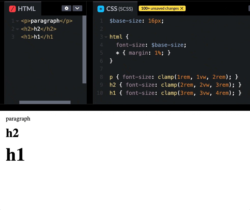
When it comes to actually defining the variables, there might need to be some slight adaptations made between what design sends over and what gets written into the CSS. Many design programs still function on a basis of pixels; while that makes sense for prototyping and designing, we’ll want to ensure that we’re using more responsive and flexible units when we define the variables on our end. By converting hard values to ems, rems, percentages, and other flexible units, we can create fluid systems that not only work well on screens of all sizes, but also can be chained together to make updates and maintenance easier.
For example, if we were to use rems for the entirety of our typography system, we can build a system where all our units are scaled relatively to the base value. We’ll set that base value at whatever design determines, then convert the rest to rems. In the future, if the design team ever needs to make an adjustment to the typography system, we can then simply adjust the base value and the rest will scale accordingly.
$base-size: 26px;

html { font-size: $base-size; }

p { font-size: clamp(1rem, 1vw, 2rem); }
h2 { font-size: clamp(2rem, 2vw, 3rem); }
h1 { font-size: clamp(3rem, 3vw, 4rem); }
Synchronizing Names
Finally, it’s important to make sure that our variable names match the design token names as closely as possible, in order to ease communication between design and development. If we’ve defined a color as “primary” and the design team refers the same color as “main”, wires will inevitably get crossed – and this only increases in complexity as our list of variables / design tokens grows longer. Every name that we synchronize lowers our chances of miscommunication. If we’re taking advantage of a component library with an associated Figma Kit (more on that in the next section), then that should already be done for us! If we’re building from scratch, however, then it’s well worth keeping in mind.
Icons
Icons are one of those “small” things that can fall through the cracks when we’re thinking about putting together a design system. While they might not be quite as foundational as our design tokens, they’re still something that we’ll need almost as soon as we start building or styling components.
Of course, we have many different ways of solving this problem. Some of the most common include pre-existing third-party icon libraries (such as Font Awesome), icons bundled into a third-party component library (like the Kendo UI Icons), or a completely custom set of icons designed and maintained by your design team. Obviously, going 100% custom will require more work (on both the design and dev side), but might be worth it to achieve a truly unique look – or if the UI will require icons for uncommon symbols or concepts.
My recommendation is (as always) to use whatever is most frictionless for your team – both developers and designers. For example, if you’re using a third-party component library (such as Kendo UI), then it’s smart for developers to use their icons for everything, in order to create a cohesive look and allow the components to blend seamlessly with the rest of the UI. That also benefits the designers, who have easy access to the exact same icon set for mockups and prototyping via the Figma Kits.
<SvgIcon icon={arrow-chevron-up} size="medium" />
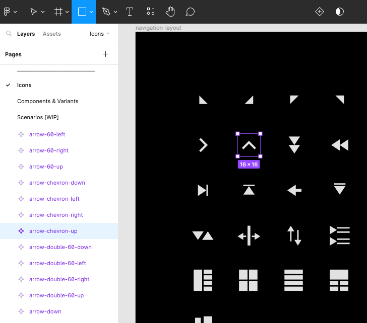
Implementing icons generally takes one of two forms: a custom icon font, or a library of SVGs. While icon sprite sheets are still an option (and some folks feel very positively about them), they’re becoming less and less common – I wouldn’t recommend going this route, simply because it’s a method less people are likely be familiar with and will therefore require more explanation and management.
Icon fonts are fonts which contain vector glyphs instead of letters and numbers. They can be styled with CSS the same way we style text. SVG icons, on the other hand, are more lightweight, load faster, and are resolution-independent. Perhaps more importantly, SVG icons are (in my opinion) easier to maintain because the entire font file doesn’t need to be updated in order to replace or adjust a single icon. SVGs also offer more flexibility for UI animation, if that’s of interest. For those reasons, I recommend going with SVGs over an icon font.
Beyond the Basics
But that’s not all, of course! In the next section, we’ll discuss what happens when we start to put those design tokens and icons to work in order to create accessible components, patterns, and templates!
Building a System
In the last section of this blog, we discussed the first steps to for implementing the groundwork of a successful design system: choosing a library, setting up our global CSS file, and defining our design tokens to coordinate with the design team. Now, let’s talk about using those smaller pieces to build larger, re-usable components.
The Component Library
What good are all those design tokens if we don’t start applying them to components, right? Ideally, the bulk of our design system implementation is done via these tokens in the form of variables that get used in the styling of the components that we build. That means that our component-scoped styles will look something like this, with the majority of the styles being imported and applied from the global CSS using the design tokens and only a few specific, unique values set manually:
.card {
  border-radius: $borderRadius;
  background-color: $primaryBG;
  border: $border;
  filter: $dropShadow;
  padding: $basePadding;
  max-width: 50%;
}
The component library is the part of a design system that developers are usually most familiar with already, so we won’t spend too much time here. For anyone who’s interested in a deeper dive on creating their own component library, check out this earlier series by TJ that breaks it down into some excellent, actionable steps. Not to mention, there are some fantastic tools out there, like Storybook, that offer tons of resources to make component library creation, maintenance, and testing a breeze.
Instead, let’s talk about some more specific aspects of component library maintenance in relation to their position within a larger design system: coordinating with designers, and building pattern libraries and templates with our components.
Staying in Sync with Design via Figma Kits
One of the most effective ways for developers and designers to stay in-sync on component design and functionality is via Figma UI kits. A good Figma kit will include a breakdown of every single component in a library, including all design tokens and various interaction states for each component. We’re already familiar with all the ways in which a component library can be beneficial for developers: they help build in accessibility, speed up development time, offer UI and interaction pattern consistency for users, etc. With a Figma kit, designers can enjoy the benefits of all those things as well – with a few additional perks!
Developers are often most comfortable working directly in code, but designers spend most of their days working in design software. For a design system to work, we need to eliminate the barriers of access that make it harder or less intuitive to use – that means that nobody should have to learn an entirely new set of skills in order to use the design system. Designers should be able to work where they prefer to work, as should developers.
By offering an exact, one-to-one replica of the component library in the workspace that designers are most comfortable with, they’re able to take a deep dive into the components from a design perspective. This not only enhances a designer’s understanding of the components and how they function, it also makes it much easier for them to adjust the style of the components to match the design system because they can see all the components in one place. Often, component library documentation splits up each component, allowing developers to focus in on the details of each one individually. While that makes sense for a development approach, designers more often need a birds-eye view, allowing them to see and understand how all the components look together within the shared design system styles.
With Figma kits, designers are empowered to do things like adjust design tokens and know exactly how that will map to the variables on the development side, communicate complex user interface ideas to developers via pixel-perfect mockups (and offer those mockups for developers to inspect with the Figma Dev Mode), and create new page or feature prototypes for early-stage user testing – just to name a few.
Designers can maintain the design system core files in Figma and share them with the development team via export tools. For example, the Kendo UI Figma Kit design tokens can be imported into ThemeBuilder Pro via the ThemeBuilder Figma plugin. This allows for easy translation of the design system from Figma into CSS. Not to mention, whenever the design team needs to make an update to a design token, they can do so in Figma and just let the development team know – when the dev team re-imports the variables, it will automatically update any components those tokens were applied to in ThemeBuilder. The dev team can then simply re-export the ThemeBuilder CSS, replace the global CSS file in their app, and see the design team’s updates applied across the entire component library – just like that! There’s no easier way to keep a component library in sync.
Pattern Libraries and Page Templates
Once we have a component library with our design system styles applied, it’s time to start putting those lego pieces together into reusable chunks. Many applications and websites reuse more than just individual components – those components most often get combined to create specific interaction patterns that repeat throughout the interface. This approach is generally based on Brad Frost’s Atomic Design approach (which, if you haven’t read, you absolutely should).
For example, maybe we repeat a pattern of components along the bottom of several different types of articles on our website: a specific layout of the author photo and information, cards with other suggested/related articles, and icon buttons for sharing on social. The pages for these articles might not always look the same, but that section at the bottom is consistent. That’s a pattern that we can capture and reuse in the same way that we do with the individual components, themselves.
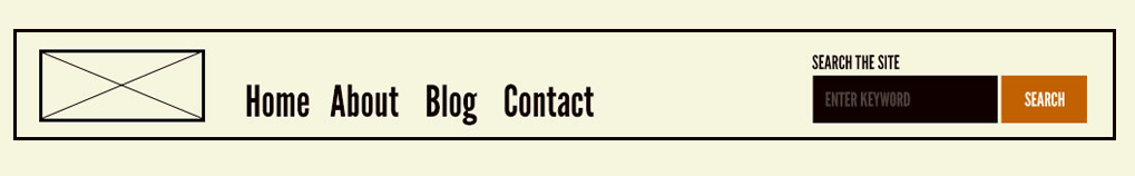
Image from Brad Frost's Atomic Design
In general, we want to think of these as separate to components, because they tend to be larger and more complex. The line between what constitutes a complex component vs. what constitutes a pattern can be fuzzy and is ultimately left up to the discretion of the developers and designers building the design system. Personally, I think of components as elements with one specific goal, wheres patterns could have several. For example, I would consider a text input + button lockup to be a component since there’s only one thing a user can do with it (submit text). However, I would consider the previously described article footer lockup to be a pattern, since the user could click on a related article, contact the author, or share the article on social. Once again, though, this is not a hard and fast rule – just my personal approach to building and organizing design systems. Ultimately, the only important part is that the entire team understands and agrees upon a single definition.
A page template, on the other hand, is much clearer – it’s a reusable layout of components and patterns for an entire page. These are especially useful for websites or applications that have many pages that will need to be visually similar but offer different content: documentation libraries, blogs, store product pages, and similar. While the content of those pages might not always be exactly the same, a template will ensure visual consistency across them all. For example, a product page might not always have the same number of photos, the same length of description, the same number of product options, etc., but we still need all product pages to look cohesive. By creating a template, we can accommodate the most basic and extreme situations – and save ourselves the time and energy of recreating work / resolving problems.
Image from Brad Frost's Atomic Design
Accessibility
Perhaps one of the greatest benefits of using a pre-made component library is being able to leverage the expertise of a whole team, without having to hire a whole team. This really shines in the world of accessibility, where not everyone feels completely comfortable or considers themselves an expert – and yet, creating an accessible application or website is truly non-negotiable. While using a third-party component library doesn’t let you completely off the hook on accessibility testing, it does greatly reduce the workload. It’s both reassuring and a time-saver to not having to worry about doing this yourself, because someone else has put in the time and research to craft an accessible experience for your users. When you’re building with accessible core components, a lot of the accessibility work happens “for free”.
That being said, there’s more to a design system than just the components. When choosing colors for design tokens or various UI elements, it’s important to make sure they meet an accessible standard for color contrast. The WCAG (Web Content Accessibility Guidelines) defines three levels of color contrast ratios – failing, AA, and AAA. AA level means the colors have enough contrast to be readable, but might still present problems for some users. AAA level means that we have achieved extremely high contrast that should be readable for the vast majority of our users. We should always aim for AAA compliance, but making sure we’re not failing is the bare minimum.
Another important aspect of accessibility and color is ensuring that we’re not communicating any information through color alone. This is a dangerously easy trap to fall into, unfortunately – especially with things like forms, data visualization, and confirmation / cancellation dialogs. Make sure to review the components, patterns, and templates with the design system styles applied to confirm that there’s always an icon or text supporting any color-coding.
When it comes to making accessible layouts and interactive UI elements, it’s good to leave some – literal – room for error. When buttons and other “click zones” are too small, they can be difficult to accurately target and interact with. We want to ensure that the padding we define for input fields, buttons, icons, and more all make them take up enough visual space that the user isn’t working with a prohibitively small target.
Finally, consider the text styles. Setting a large enough text size is step one; 16 pixels is the standard recommendation size for body copy. More important than the default size, though, is how users can adjust it. Having a built-in text adjustment in your settings is a nice touch, since that will allow a user to increase the size of the font without effecting the other elements on the page…but, since that’s rare, we also have to think about what happens when a user increases the zoom on the page via the browser tools. If zooming in breaks our components, patterns, or templates, then it’s back to the drawing board.
Using Storybook to Support Accessible Design System Implementation
Thankfully, Storybook has a bunch of great addons that will make accessibility a natural part of design system implementation and component design. I highly recommend addon-a11y; it’s probably the most popular and beloved Storybook accessibility addon – and for good reason! It's packed with great features, and it runs on the well-known Axe Accessibility Engine.
The Accessibility panel that this component adds is one of the best and easiest ways to test as we work in Storybook. Each time the component loads, it will check it against the WCAG, and we can make the changes while still in the build phase, rather than finishing a component completely and then having to go back and try to retrospectively make it accessible. Each violation that appears will have a "more info" link to the WCAG website, where we can learn more about the guideline that your component hasn't met, and how to fix it. The vision simulators are also incredibly useful, as a way to literally see what our users will see when they use our UI. These are great for checking font size, density, contrast, and color choices. Sometimes, it can be hard to put ourselves into the shoes of our users, but this tool makes it literally just a click away.
The aria-live-storybook-addon is also a handy one to add – it adds a new panel to the drawer called 'Aria Live Regions', which will show any time an action triggers an aria-live announcement, as well as whether it's polite or assertive. This way, we can confirm that announcements are triggering correctly when new content is added to the page, and that the correct type of announcement is being made.
Finally, storybook-addon-psuedo-states allows us to quickly toggle through all possible element pseudo states from the Storybook menu bar. This addon basically duplicates the functionality of the "Toggle Element State" tool from Dev Tools, but without us ever having to leave Storybook. Pseudo states are incredibly important for accessible development – especially the focus and focus-within states. Any users who use a keyboard as their primary method of navigation will need a clearly visible focus in order to find their way around. Some elements, like buttons, inputs, etc. have focus states built in – but occasionally, we’ll need to add a focus state to something that doesn't automatically have one. Most design systems include new styling for the focus state, since the default blue highlight doesn’t usually match…well, anything. Being able to easily design, develop, and test these within Storybook is a huge advantage. This is also hugely useful for checking colors and contrast on your hover, active, and visited states. Remember: if we have a button that's only clearly readable in some – but not all – interaction states, then we don’t have an accessible button!
Design Systems are for Developers, Too!
As I hope you’ve seen from these two articles, design systems happen just as much on the development side as they do on the design side – don’t be fooled by the name! For a design system to truly be integrated and applied to an application, it needs to live in the codebase as much as it lives in the design software. Thankfully, we have lots of tools – like Figma, Storybook, and the Kendo UI component library – to help us bridge that gap and make sure we’re keeping things in sync. When we embrace the use of a design system, it doesn’t take long for both us and our users to see the benefits in our website or application!
◀ Back to all blogs